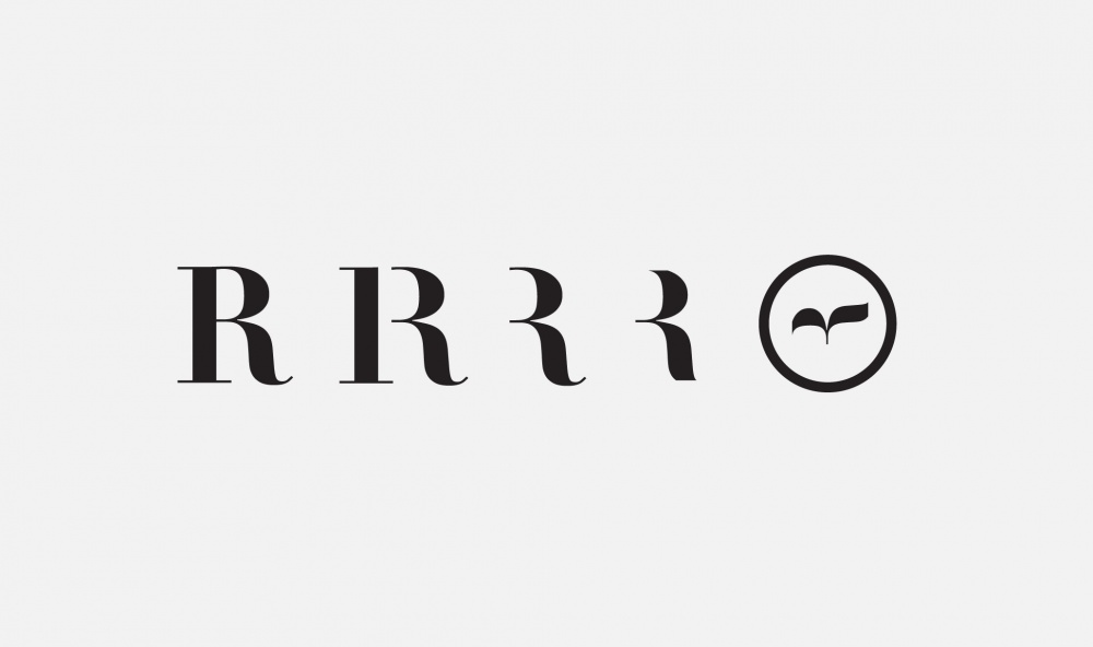
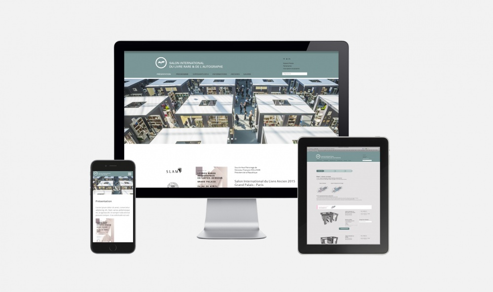
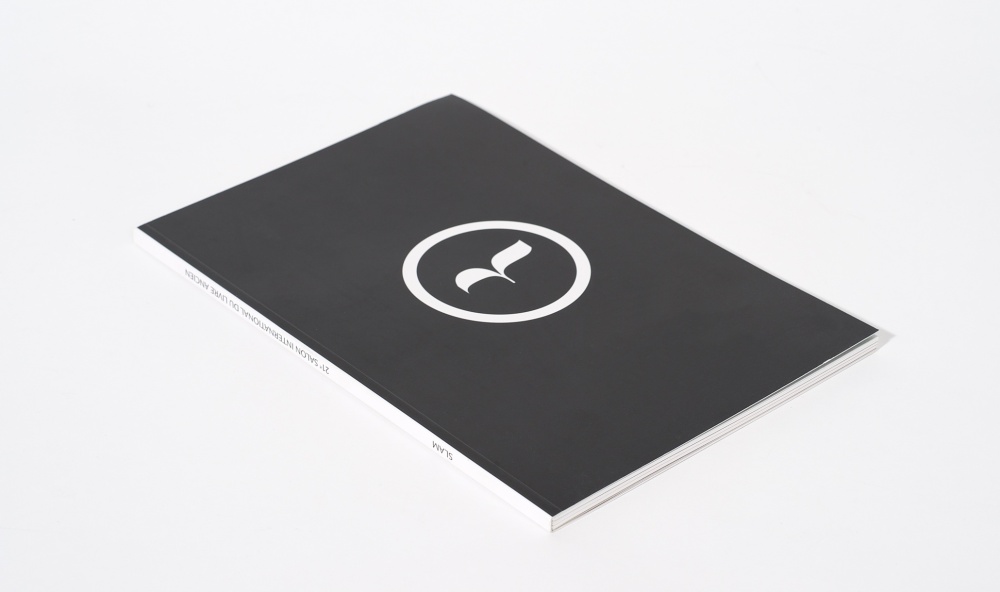
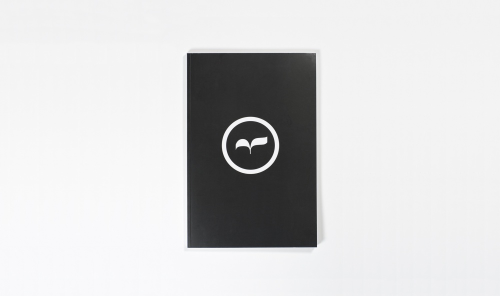
Depuis 1984, le Salon international du livre ancien rassemble des passionnés du patrimoine écrit ainsi qu’une grande diversité de documents. L’identité visuelle s’inscrit dans la mémoire du graphisme français. Une recherche typographique à partir du célèbre caractère Didot, réputé pour sa légèreté et sa distinction, a permis de transformer la lettre « R » en un livre ouvert, prêt à s’envoler. Le logo au dessin élégant est utilisé chaque année sur les différents supports de communication. Une véritable révérence à la richesse de cette bouillonnante manifestation culturelle, organisée par le Syndicat de la librairie ancienne et moderne.
Every year since 1984, the Paris-based International Antiquarian Book Fair brings together a large number of professionals passionate about the written heritage and eager to share the great diversity of documents they have collected. The visual identity belongs to the French graphic tradition : Studio LWA worked from the Didot typeface, easily recognisable with it slender and refined style, to turn a letter 'R' into an open book, seemingly about to fly off. This elegant logo design is reproduced every year on the communication material of the event, in a tribute to the diversity of the exhibits on show. The busy and popular cultural event is organised by Le Syndicat de la librairie ancienne et moderne.
Depuis 1984, le Salon international du livre ancien rassemble des passionnés du patrimoine écrit ainsi qu’une grande diversité de documents. L’identité visuelle s’inscrit dans la mémoire du graphisme français. Une recherche typographique à partir du célèbre caractère Didot, réputé pour sa légèreté et sa distinction, a permis de transformer la lettre « R » en un livre ouvert, prêt à s’envoler. Le logo au dessin élégant est utilisé chaque année sur les différents supports de communication. Une véritable révérence à la richesse de cette bouillonnante manifestation culturelle, organisée par le Syndicat de la librairie ancienne et moderne.
Identite visuelle et marqueÉditionWeb & DigitalPhotographieImprimés
Every year since 1984, the Paris-based International Antiquarian Book Fair brings together a large number of professionals passionate about the written heritage and eager to share the great diversity of documents they have collected. The visual identity belongs to the French graphic tradition : Studio LWA worked from the Didot typeface, easily recognisable with it slender and refined style, to turn a letter 'R' into an open book, seemingly about to fly off. This elegant logo design is reproduced every year on the communication material of the event, in a tribute to the diversity of the exhibits on show. The busy and popular cultural event is organised by Le Syndicat de la librairie ancienne et moderne.
 QUARTIER DES ARTS
S.L.A.M.
QUARTIER DES ARTS
S.L.A.M.


