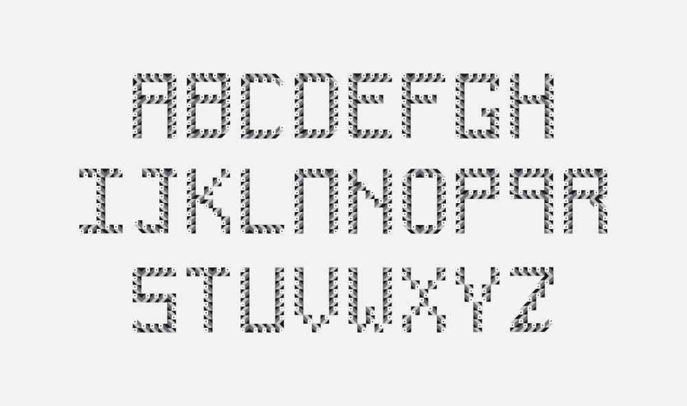
Destinée à orner des affiches créées pour la Scottish Poetry Library, la famille de caractères Sémaphore a ensuite été déclinée pour la signalétique du métro de Glasgow. Telle une balise maritime dans la nuit, cette typographie est un phare graphique dans l’obscurité métropolitaine. Cette fonte est utilisée dans différents domaines : communication, guidage, indication…
Initially designed to feature on advertising posters for the Scottish Poetry Library, the Sémaphore font has also been used for the signage system of the Glasgow metro network. Like a buoy shining in the night, the typeface is a graphic lighthouse in the metropolitan darkness. The font has been also used on material for communication, guidance and informational purposes.
01.02.2009 PARIS | TYPE | Scottish Poetry Library | Sémaphore
Destinée à orner des affiches créées pour la Scottish Poetry Library, la famille de caractères Sémaphore a ensuite été déclinée pour la signalétique du métro de Glasgow. Telle une balise maritime dans la nuit, cette typographie est un phare graphique dans l’obscurité métropolitaine. Cette fonte est utilisée dans différents domaines : communication, guidage, indication…
Typographie
Initially designed to feature on advertising posters for the Scottish Poetry Library, the Sémaphore font has also been used for the signage system of the Glasgow metro network. Like a buoy shining in the night, the typeface is a graphic lighthouse in the metropolitan darkness. The font has been also used on material for communication, guidance and informational purposes.
 Losange communication
S.L.A.M. & C.S.E.D.T.
Losange communication
S.L.A.M. & C.S.E.D.T.


