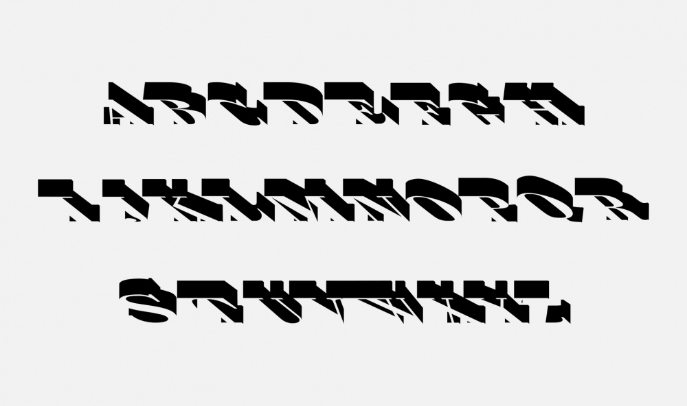
Le Studio LWA a conçu le caractère Lux. Mise en perspective d'une typographie inspirée du caractère Bodoni. Utilisée en typographie de titrage presse, le blanc du papier pénètre la lettre et donne de l'éclat lumineux au mot composé. Son nom fait référence à l'unité de mesure de l'intensité lumineuse
Studio LWA has designed the Lux typeface. Initially derived from the Bodoni font family, Lux is used for titles in press typography. Paper seems to shine through the letters, bringing each written word brightness ; hence its chosen name, a reference to the unit measuring the intensity of light. Fiat lux !
Le Studio LWA a conçu le caractère Lux. Mise en perspective d'une typographie inspirée du caractère Bodoni. Utilisée en typographie de titrage presse, le blanc du papier pénètre la lettre et donne de l'éclat lumineux au mot composé. Son nom fait référence à l'unité de mesure de l'intensité lumineuse
Typographie
Studio LWA has designed the Lux typeface. Initially derived from the Bodoni font family, Lux is used for titles in press typography. Paper seems to shine through the letters, bringing each written word brightness ; hence its chosen name, a reference to the unit measuring the intensity of light. Fiat lux !
 EST ENSEMBLE
FRANCESCO SMALTO
EST ENSEMBLE
FRANCESCO SMALTO


